Summary
The redesign of claim history was a visual overhaul that focused on modernizing the UI and making claims easy to find. The redesign increased traffic by 400% year-over-year.
Starting Point
This was the first feature that the mobile team redesigned in the Group Benefits app. Our mission was to transform the hybrid app into a fully native iOS and Android experience. We began the app redesign with Claims History since it was our most used feature.
Identifying Usability Issues
The old UI relied heavily on a chart-based interface that lacked elements to promote user interaction. Every claim looked the same and users were forced to read lots of small text to access their claim information.
The Redesign
The design objective was to establish a foundational user experience that made finding claims simple.
Transforming Table Rows into Cards
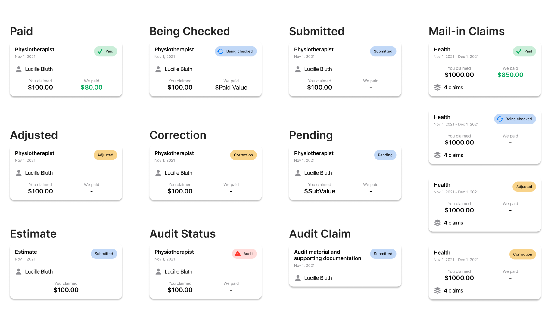
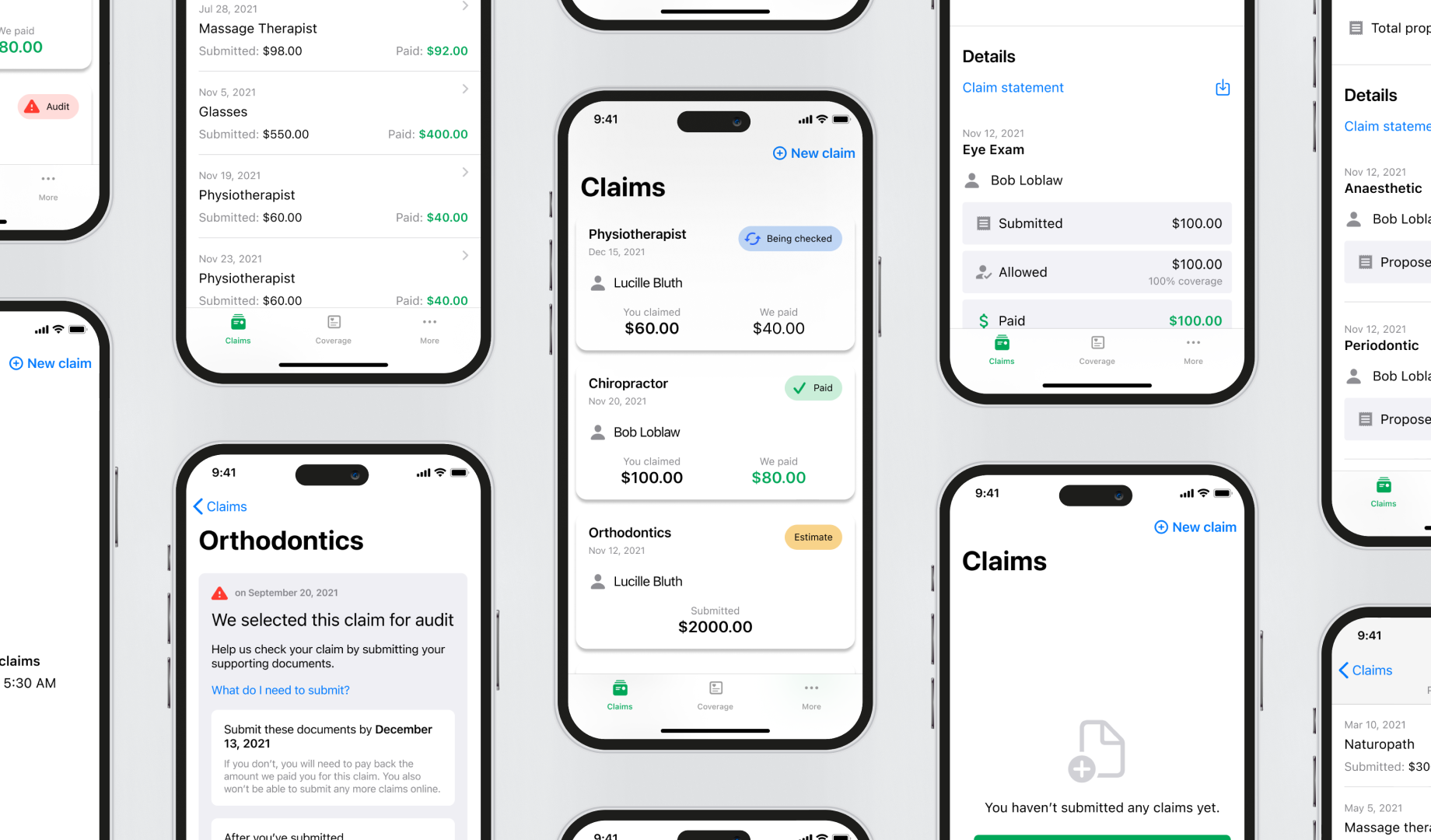
The primary layout change involved transforming the table rows into cards. Cards are an optimal component for a mobile experience, and were designed to emphasize the service type and claim status, making it simple for users to identify claims. Usability testing was done to ensure that the card design had the perfect balance of information so users could identify the claim, without being overwhelmed with information.

Making Audits Easy
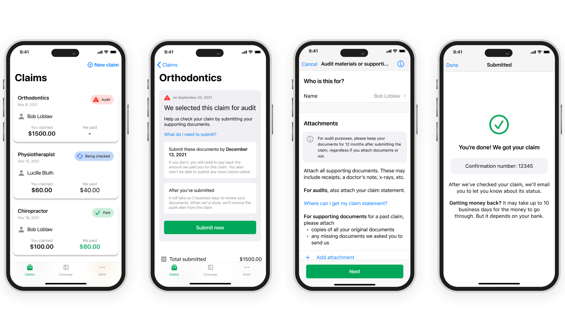
The team implemented a novel feature to enhance the user experience during audits. In the previous user interface, audits were merely flagged without any guidance on how users should resolve them. When we redesigned the audit submission flow as part of the ‘Submit a Claim’ redesign, I added an alert to flag the audit, and included a direct link to expedite their entry into the audit submission workflow.

Wrap Up
The redesign, coupled with an effective marketing campaign, resulted in a remarkable 400% year-over-year surge in claims traffic. This achievement served as a significant revelation for our business partners, who had not previously placed a strong emphasis on the mobile channel. Following the successful launch of the revamped Claims feature, we garnered substantial support to proceed with the redesign of more intricate features within the app.
