Summary
Manulife Group Benefits aimed to improve the utilization of its prescription drug tools, Drug Plan and Pharmacy Savings Search, due to underuse by members. Extensive research led the way to a user-centric redesign that provides a user-friendly and effective prescription drug experience.
Business Problem
The redesign was driven by a technical requirement stemming from Apple's security policy. Previously, the prescription drug tools redirected users to Manulife's website, which was no longer allowed. This was an opportunity to redesign the tool to encourage user to buy lower-cost prescription drugs so that both members and their employers can save money.
Deconstructing the Tools
The existing Drug Plan and Pharmacy Savings Search interfaces had major usability issues, such as unclear actions, difficult to tap buttons and poor information architecture. My goal was to identify user struggles and optimize these tools to best serve our users. While both tools are closely related, they have to work separately since they are sold as individual tools.
Listening to Complaints
I leveraged Manulife’s call centre to gather qualitative data about our users’ problems with the Drug Coverage and Pharmacy Savings Search tools. User complaints and frustrations highlighted key issues, such as finding coverage information, and discrepancies between Drug Plan's "you pay" amount and the actual pharmacy costs. Members were frustrated, and it was clear that many of the well-intended disclaimers in the app were poorly placed and easily forgotten.
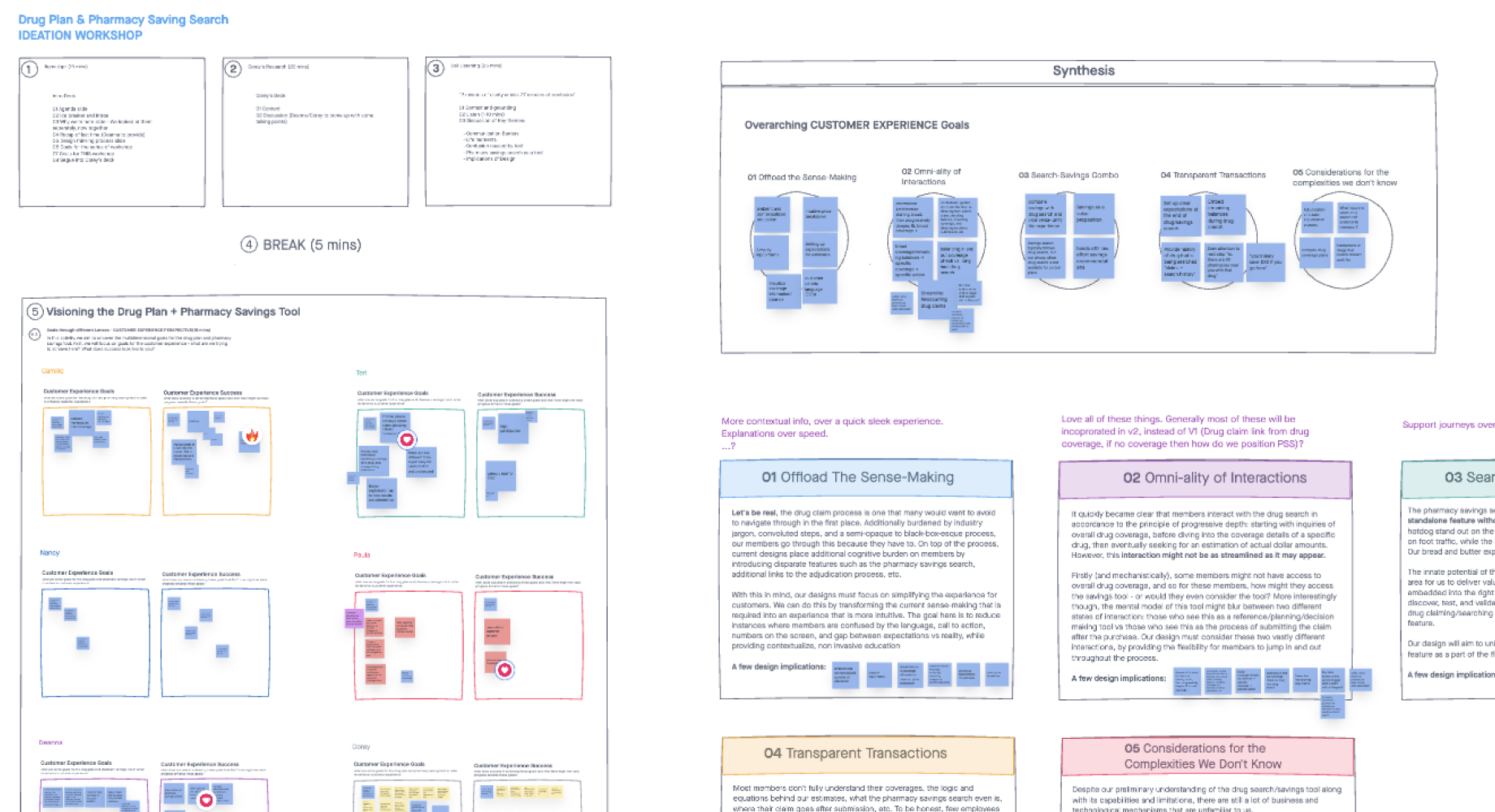
Problem Framing with Business Stakeholders
I conducted problem framing and vision-setting sessions with stakeholders, defining success criteria for the business, customers, and members. The problem framing session uncovered the business’ major concerns, internal workings, and technical limitations. The vision-setting session was crucial in aligning goals and providing a direction to focus on.
Analytics to Quantify Problems
Analyzing Drug Plan and Pharmacy Savings Search data revealed critical insights and brought up a number of interesting questions:
1. Most users didn't search for drugs
- Only 34% of desktop sessions and 1.2% of mobile sessions searched for a drug after entering either drug tool.
2. Drug searches were for commonly advertised medications
- This suggested that members may be researching their coverage before they’ve visited a doctor.
- None of the top 20 searches were part of the most commonly prescribed drugs in Canada (2018).
3. Drug Plan was more popular than Pharmacy Savings Search, despite most members having access to both
- Drug Plan averages 13X more traffic than Pharmacy Savings Search.
- Only 10% of traffic flowed from Drug Plan to Pharmacy Savings Search.
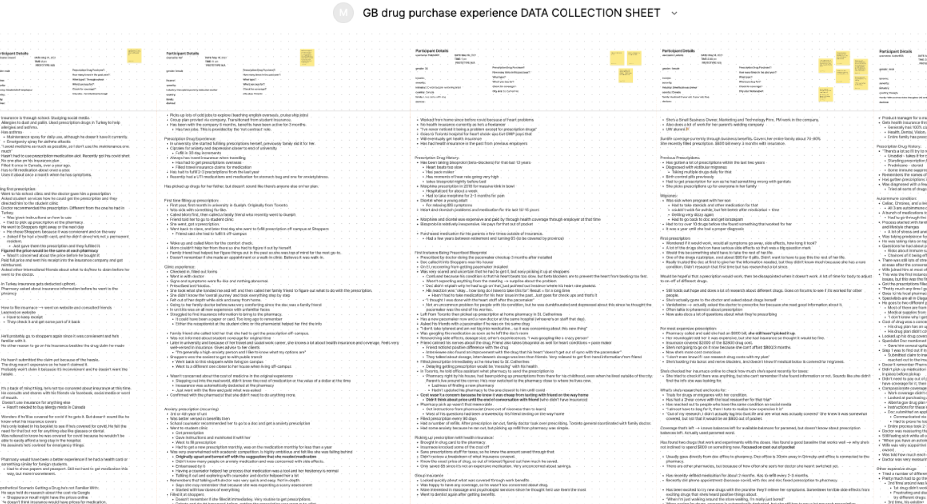
Generative Research to Understand the Member Journey
Collaborating with a UX Researcher, we conducted interviews to uncover the member journey between getting and filling a prescription. We conducted ten 1-hour long research interviews with Canadians of varying ages, family sizes, geographies, pharmacy experiences and health needs. Our research indicated that redesigning the tools alone might not lead to increased usage.
I proposed to the business that we redesign the tools as planned and monitor traffic after it was released. We could test our hypothesis and see if the redesign increased usage. If not, then we could work on an alternative strategy to better integrate the prescription drug tools into the member journey.
Three key insights from this research shaped the redesign:
1. Health takes priority over price
- People see these medications as the key to recovery. Typically, they focus on drug costs much later in their journey, often only considering prices when they're about to make a purchase.
2. Limited Time Between Prescription and Purchase
- Expecting members to check drug prices before filling their prescriptions is unrealistic because it's not a top-of-mind concern at that moment.
3. Little insights make a big difference
- Many individuals lack awareness regarding drug coverage and pricing. Only a minority know that drug prices can vary between pharmacies. These insights, though often overlooked, have the potential to greatly benefit members.
The Redesign
The redesign prioritized delivering information that matters most to our members in a user-friendly manner.
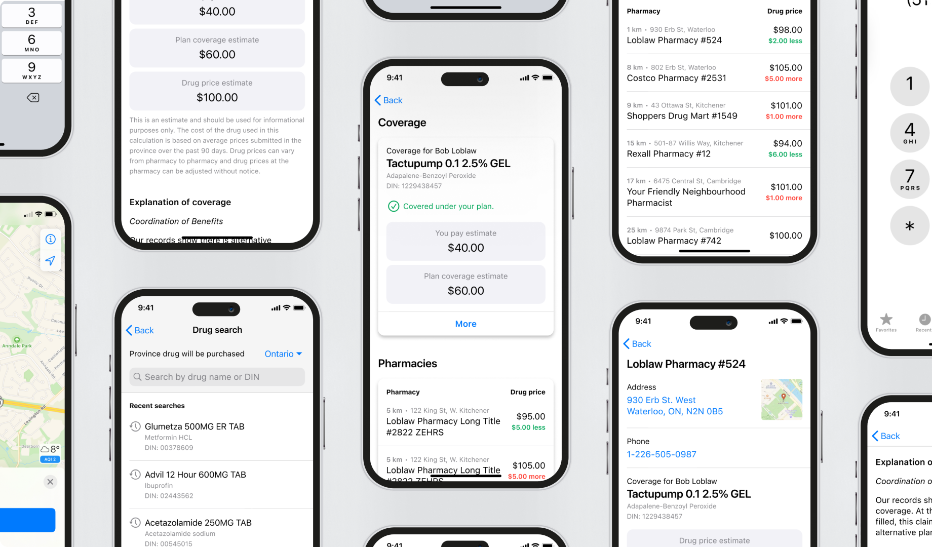
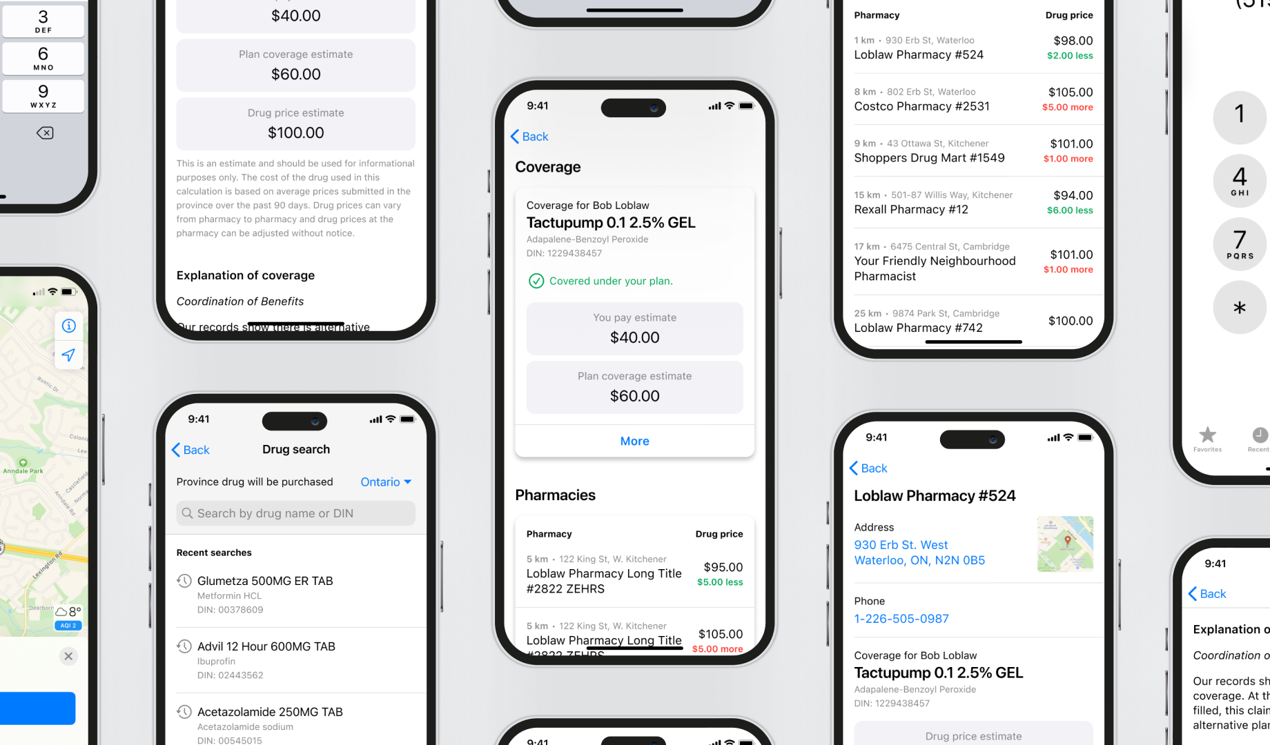
Give Coverage and Pharmacies Equal Visibility
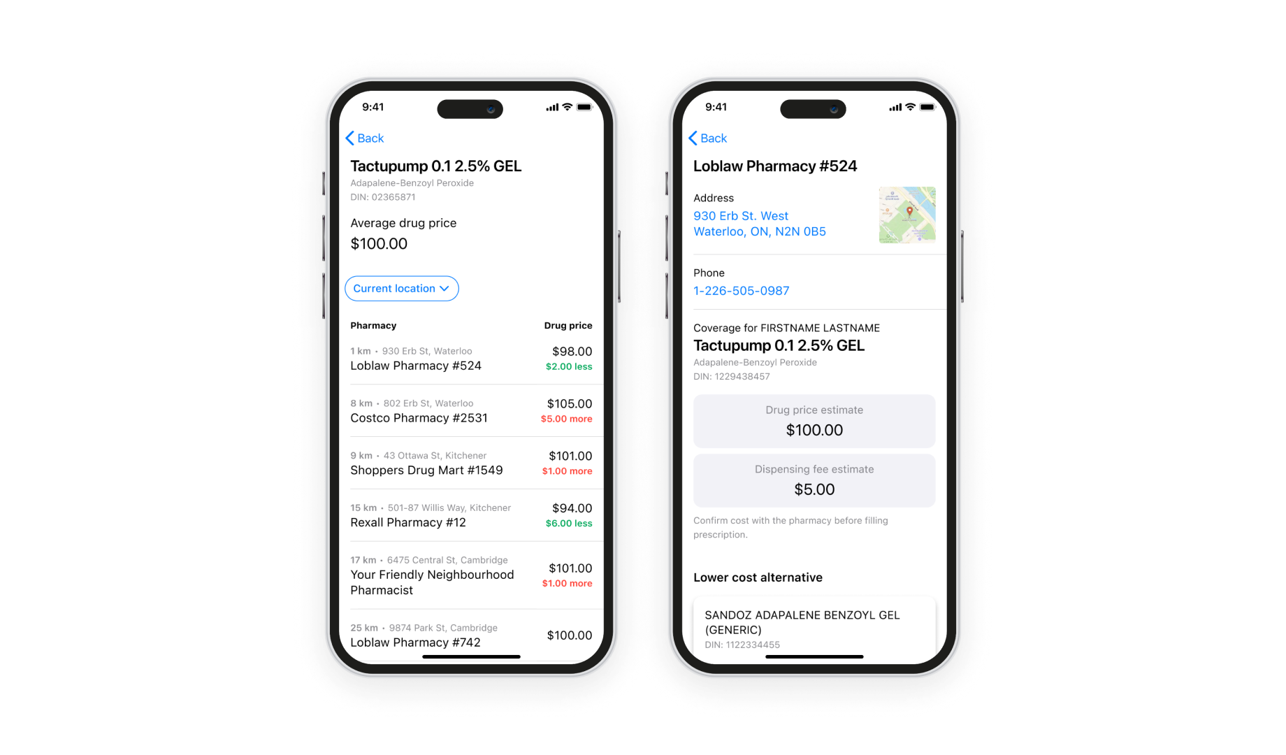
The first key transformation involved revamping the visual architecture. After members search for their medication, they now encounter an intuitive page offering a concise overview of both Drug Plan and Pharmacy Savings Search. This page presents essential details, such as payment estimates and medication costs at nearby pharmacies, in a readily digestible format. Users can delve into specific sections for more in-depth information.

Enhancing Visibility of Pharmacy Prices
The redesign sought to enhance the visibility of pharmacy prices. The new layout simplifies the identification of average drug prices in your vicinity and highlights which pharmacies charge above or below the average. We employed colour-coding to facilitate easy scanning, clearly distinguishing "more expensive" from "less expensive" options. Expressing these price differences in actual dollar amounts eliminated the need for mental math.
Precision in Language
To ensure clarity in communication, I assumed responsibility for all UX writing in this project. The research revealed that coverage amounts in Drug Plan, such as "You pay" and "Your plan pays," represent averages rather than exact figures due to varying pharmacy pricing. I adjusted these labels to emphasize their estimative nature. Moreover, I repositioned legal disclaimers related to varied drug prices under the coverage section to reinforce their status as estimates.
An additional design adjustment involved prioritizing the member's out-of-pocket expenses. While this change might appear straightforward, our research indicated that individuals remember and prioritize their personal costs rather than the overall drug price.
Contextualize Legal Disclaimers
Members frequently overlooked or forgot the previously front-loaded legal disclaimer. I broke up the long disclaimer and moved the pieces to the appropriate content sections. This approach eliminates the need for users to retain the disclaimer's content, making it more likely that individuals will engage with smaller, contextually relevant sections of information. Collaborating closely with the legal team, we ensured all required language adjustments were seamlessly integrated.
Wrap Up
I had left Manulife before this project was released, but I anticipate the redesign led to increased usage and improved understanding of the tools. The redesigned UI is more user-friendly, and business stakeholders were thrilled with the changes.